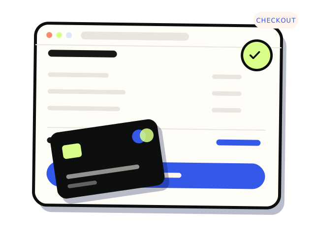
The checkout fixes that most often stop customers abandoning their cart are simple: show shipping costs and delivery times before checkout, allow guest checkout, offer express payments such as Apple Pay and Google Pay, make the forms easy on a phone, keep the pages fast, and make errors clear and recoverable. Most stores do not need a redesign. They need to find the one or two points where real customers stall, and fix those.
Where are customers actually dropping off?
Before changing anything, find out where people leave. Most platforms and analytics tools can show how many sessions add to cart, start checkout and complete payment. A big drop between cart and checkout points to cost surprises or friction on the cart page. A big drop inside checkout points to the forms, shipping step or payment step.
Then do the cheapest research there is: buy something from your own store, on your phone, on mobile data, as a new customer. Use a real Australian address and a discount code. Note every moment you hesitate, have to scroll back, or are not sure what happens next. Ask a friend who has never used the store to do the same while you watch without helping.
If you are not tracking checkout steps yet, our guide to what a small business should actually track covers the events worth setting up.
Is the total a surprise?
Unexpected costs at the last step are one of the most common reasons people walk away. If shipping only appears after the customer has typed their address, many will leave to check elsewhere.
- Show shipping options and prices on the product or cart page, or at least a clear rule such as a free shipping threshold.
- Show estimated delivery times, and be realistic about regional and remote areas.
- Make it obvious whether prices include GST. Most Australian shoppers expect GST-inclusive prices.
- If you charge a card surcharge, show it before the final step, and check the current RBA and ACCC guidance on surcharging.
- Make returns and exchanges easy to find from the cart. For fashion stores in particular, sizing and returns questions often stop the purchase.
Are you forcing people to create an account?
Asking a first-time customer to make an account before paying adds a password, a confirmation email and a reason to leave. Let people check out as a guest, then offer an account after the order, when they have a reason to want one. If you need accounts for wholesale or members, keep that path separate from the normal one.
Is it easy to pay?
Express payment options let returning shoppers skip most of the form. Depending on your platform and gateway, that can include Apple Pay, Google Pay, Shop Pay or PayPal, and buy now, pay later options such as Afterpay or Zip. Only add the ones your customers actually use, because a wall of payment buttons adds clutter of its own.
Check that each method works on the devices your customers use. A wallet button that appears on desktop but fails on an iPhone is worse than no button. If you are choosing a gateway, our comparison of Stripe, Square and Tyro covers the fit questions.
Are the forms painful on a phone?
Most checkout friction is in the forms, and most of it is worse on mobile. A quick checklist:
- Ask only for what you need to deliver the order. A company name or a second phone number rarely needs to be required.
- Use address autocomplete if your platform supports it, and make sure suburb, state and postcode work for Australian addresses.
- Set the right input types, so phone and postcode fields bring up a number keypad.
- Make sure browser autofill works. Fields with correct
autocompleteattributes fill in with one tap. - Keep labels visible above fields rather than relying on placeholder text that disappears when you type.
- Make buttons and checkboxes large enough to tap without zooming.
- Do not clear the whole form when one field has an error.
Many of these overlap with accessibility. A checkout that works with a keyboard and a screen reader is usually easier for everyone. Our WCAG 2.2 guide has the quick checks.
Are errors clear, and recoverable?
When a card is declined or a discount code fails, the customer should see a plain message next to the problem and a clear way forward. “Something went wrong” with an empty cart is how sales disappear. Try the unhappy paths yourself: a wrong postcode, an expired discount code, a declined test card, the back button halfway through payment. Each one should leave the customer with their cart intact.
If something goes wrong only after payment, such as an order that never shows up as paid, see our article on fixing Stripe webhooks.
Is it fast enough?
A slow cart or checkout feels risky, especially on a phone. Common causes are heavy product images, too many apps loading scripts on every page, and third-party widgets such as chat, reviews and pop-ups. Remove what you do not use and check what is left. Our explainer on Core Web Vitals covers what to measure.
Do customers trust the page?
A checkout that looks different from the rest of the store, or has spelling mistakes and broken images, makes people wonder whether it is safe. Keep the branding consistent, show a contact method, and make policies easy to find. Pop-ups asking for an email address in the middle of checkout do more harm than good.
On Shopify, the checkout itself can only be customised in the ways Shopify allows, and what is available depends on your plan. Many of the fixes above happen on the product and cart pages instead, which you control fully.
What about abandoned cart emails?
Reminder emails can bring some customers back, and both Shopify and WooCommerce support them, natively or through apps. Treat them as a safety net, not a fix for a broken checkout. They are also marketing messages, so make sure you meet the Spam Act requirements for consent and unsubscribing. The ACMA has guidance, and your adviser can confirm what applies to you.
If you only fix three things
Show the full cost before checkout, let people pay without making an account, and make the forms work on a phone with autofill. Then buy something from your own store every month to make sure it still works.
If you have found the problem and want it fixed, our Shopify development work covers cart and checkout changes, and our UX design audits look at the whole path for stores on any platform, including the jobs on our e-commerce page and fashion page. From $400 for a custom section. Most Shopify builds land between $400 and $3,500.