In Australia, the Disability Discrimination Act 1992 makes it unlawful to discriminate against people with disability in providing goods and services, and that is generally understood to include websites. The law does not name a technical standard, but the Web Content Accessibility Guidelines (WCAG) at level AA are the common benchmark, and WCAG 2.2 is the current version. For a small business, a practical approach is to test your key pages and flows against WCAG 2.2 AA, fix the problems that stop people completing tasks, and keep checking as the site changes.
This is a practical guide, not legal advice. If you have received a complaint or need to know your obligations, talk to a lawyer and read the Australian Human Rights Commission’s own guidance.
What does the law actually say?
The DDA is a federal law. It covers businesses that provide goods, services or information to the public, and people can make a complaint to the Australian Human Rights Commission if they believe they have been discriminated against. The Commission has published guidance on web accessibility that points to WCAG. Australian government agencies are expected to meet WCAG at level AA, and that has made AA the reference point most people use for private sector sites too.
There is no certificate you can buy and no single test that proves a site is compliant. What you can do is show that you have taken reasonable steps: tested, fixed what you found and kept going.
What are WCAG 2.2 and level AA?
WCAG is published by the W3C, the body that develops web standards. It sets out testable success criteria grouped under four principles: content should be perceivable, operable, understandable and robust. Each criterion has a level: A is the minimum, AA is the widely used target, and AAA is the highest and not expected across a whole site.
WCAG 2.2 became a W3C Recommendation in October 2023. It keeps almost everything in 2.1 and adds criteria that matter for everyday sites, including:
- Focus not obscured. When someone moves through the page with a keyboard, the highlighted element should not be hidden behind a sticky header, cookie banner or chat widget.
- Target size. Buttons and links should be large enough, or spaced far enough apart, to tap reliably. The AA minimum is 24 by 24 CSS pixels, with some exceptions.
- Dragging movements. Anything that needs dragging, such as a slider or map, should also work with a simple click or tap.
- Redundant entry. Do not make people type the same information twice in one process, such as a shipping address they already gave.
- Accessible authentication. Logging in should not depend on a memory or puzzle test, and password managers and pasting should work.
Quick checks you can do yourself
You do not need special software to find the most common problems. Pick your homepage, a key service or product page, and your main form or checkout, and run through these:
- Keyboard only. Put the mouse aside and use Tab, Shift-Tab, Enter and Space. Can you reach every link, button and form field, open the menu, and submit the form? Do you ever get stuck?
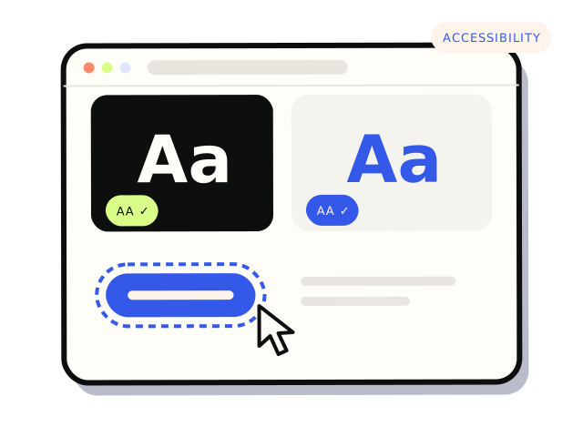
- Visible focus. As you tab, can you always see where you are? A missing focus outline is one of the most common failures.
- Colour contrast. Normal text needs a contrast ratio of at least 4.5:1 against its background, and large text at least 3:1. Free contrast checkers will tell you in seconds. Light grey text on white is the usual culprit.
- Alt text. Images that carry meaning need a short description. Decorative images should have empty alt text so screen readers skip them. Check product photos and images of text in particular.
- Form labels. Every field needs a visible label that stays put, not just placeholder text. Error messages should say what is wrong and how to fix it, in words, not just by turning a border red.
- Zoom. Zoom the browser to 200 per cent. Text should still be readable, and nothing should overlap or disappear.
- Headings and links. Headings should be in a sensible order, and link text should make sense out of context. “Click here” does not.
If you want to go a step further, try the screen reader built into your device: VoiceOver on Mac and iPhone, TalkBack on Android, or Narrator on Windows. Even a few minutes shows how your page sounds to someone who cannot see it.
Automated scanners such as the accessibility checks in browser developer tools are useful for catching things like missing labels and low contrast. They cannot judge whether alt text makes sense or whether a flow can be completed, so they find some problems, not all of them.
Do accessibility overlays fix the problem?
No. Overlays are scripts that add a toolbar or claim to fix accessibility automatically. They do not change the underlying code, so a button that cannot be reached by keyboard, a form with no labels or a checkout that traps focus usually stays broken. Many disabled people and accessibility specialists report that overlays get in the way of the assistive technology they already use. An overlay is not a substitute for fixing the site, and it should not be relied on as evidence of compliance.
Where to start fixing
Prioritise by task, not by page count. The pages that matter most are the ones where people try to do something: contact you, book, buy or log in. A problem that stops someone completing a booking matters more than a contrast issue in the footer.
- Fix the main flows first: navigation, contact and quote forms, booking, cart and checkout.
- Fix site-wide components next, such as the header, menu, buttons and form styles. One fix there repairs every page.
- Write alt text for key images, and set a habit for new content.
- Check third-party widgets such as booking tools, chat and embedded maps. If they fail, ask the provider about their accessibility, or consider an alternative.
Many of these fixes overlap with good checkout and form design. Our article on checkout fixes that stop cart abandonment covers the form side, and if you are planning a new site, the website launch checklist is a good place to build accessibility checks in from the start.
Keeping it accessible
Accessibility is not a one-off. New pages, plugin updates, a new theme or a new booking widget can all introduce problems. Re-run the keyboard and contrast checks after any significant change, and include accessibility when you brief a developer, so it is part of the job rather than an afterthought.
If you only do three things
Try your main form or checkout with the keyboard only, check your text contrast, and make sure every form field has a proper label. Those three catch many of the barriers people most often run into.
If you would like your key flows tested and fixed against WCAG 2.2 AA, our accessibility and WCAG fixes start with an audit of the pages that matter most, and our UI and UX design work can rework components that need more than a patch. Audits of key flows from $750. Most audit-and-fix jobs land between $750 and $4,000.